
Is your website design mobile friendly? Once upon a time, websites were only designed to be viewed on computer monitors that were more or less all the same size. But with the advent of the smartphone and the tablet, suddenly websites were accessible from screens of all sizes and shapes – big, small, landscape, portrait, full-screen, widescreen…
As the mobile device market grew, so did the range of display resolutions on which people browsed the web. It presented a new challenge to web developers: how to make a single website work on dozens of differently-sized and shaped displays. It’s a challenge that, even today, not every website gets right.
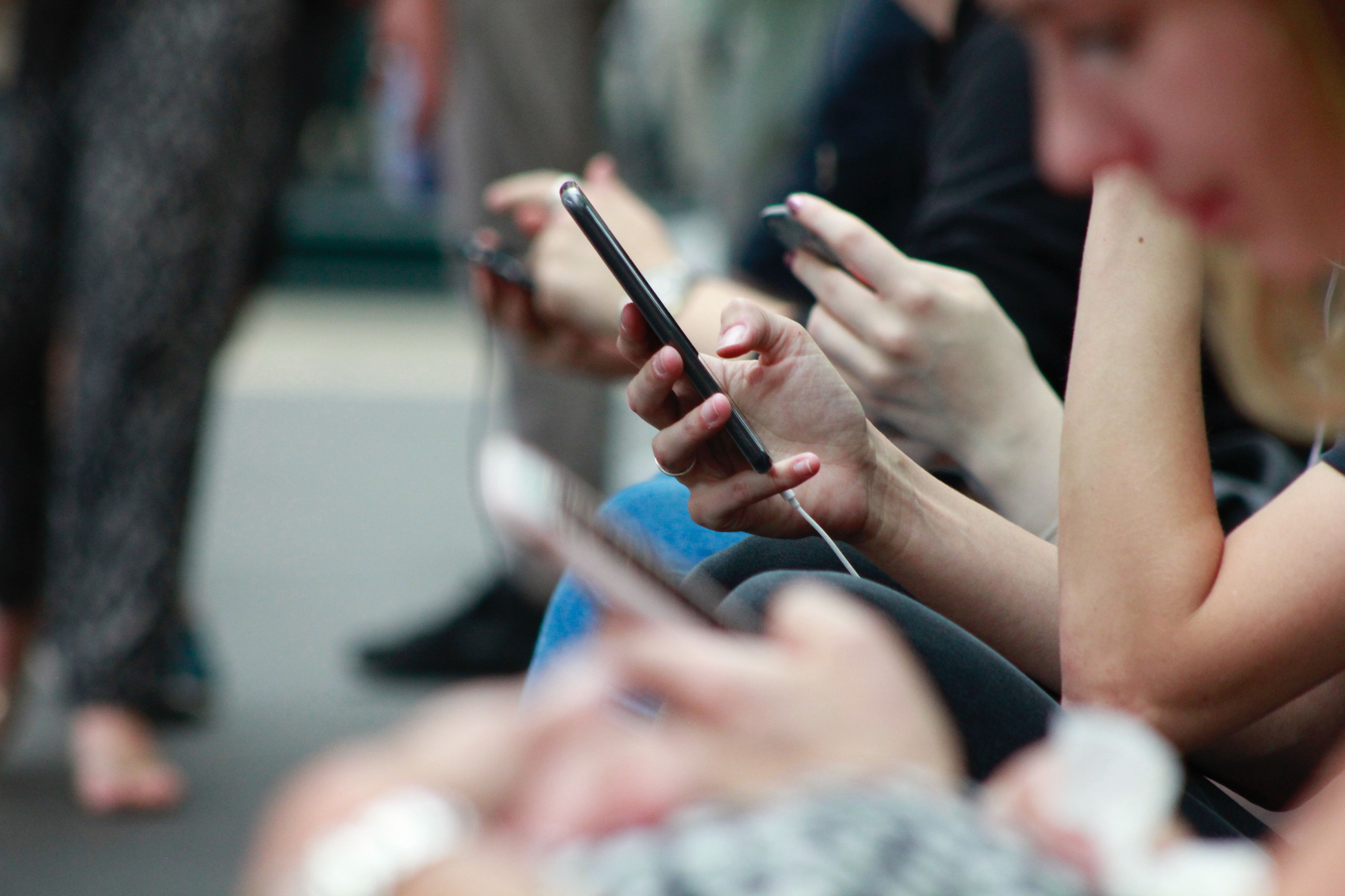
In the first quarter of 2021, over 50% of all website hits came from mobile phones1. In other words, if your website is not displaying properly on a mobile device, half of your potential customers are struggling to view it. Additionally, because Google loves mobile-friendly sites, having one that only works properly on desktops can hurt your SEO and reduce your inbound web traffic.
So how do you work out what’s going wrong? Here’s a list of potential issues that can make your site look different on mobile.
Your website design doesn’t have a mobile version
If there’s no mobile version of your website online, a phone browser will display the desktop version instead and simply shrink it to fit the available screen space, resulting in a tiny web page that you need to zoom in to read.
Your website isn’t responsive
You don’t need a separate mobile version of your website if it’s responsive – in other words, the information on the screen will automatically adjust to the size of any display. You can test this by opening your site in a desktop browser and resizing the window. A responsive site will rearrange itself as the window shrinks or grows.
Your website design code needs tweaking
If your site is responsive, but parts of it still look odd, then it could be missing some code that tells it how to arrange all the elements so that they remain in proportion with each other.
Your images aren’t optimised for high-resolution screens
Each year, phone manufacturers scramble to outdo each other with ever-increasing screen resolutions, adding more and more pixels for extra sharpness. When each pixel takes up less room on the screen, so do your images, so the phone enlarges them to display at the correct size compared to the rest of the content. If it enlarges an image to more than 100% of its original size, that image will look pixelated or blurry.
Your media is unsupported or too big
If your videos, image carousels, or animated graphics aren’t displaying, they could be in a file format that doesn’t work on mobile phones (for example, Adobe Flash, which was officially discontinued in 2020). Additionally, if they’re very large files. They may be slow to display – or not load at all if the phone is in a poor cellular reception area or connected to a slower data stream.
Moreweb’s small business websites are fully responsive and designed to look great on any screen, large or small. Contact us if you’d like to get your website sorted for mobile.
- https://www.statista.com/statistics/277125/share-of-website-traffic-coming-from-mobile-devices/
